-
Spray Paint
- Nozzles & Adapters
-
Markers
- Ink & Paint Refills
- Tattoo Supplies
-
Accessories
- Blackbooks & Canvas
November 05, 2024

You have stayed consistently innovative in your letter structure with countless styles and techniques. A lot of writers stick with the same style and run with it for decades, what motivates you to create with such diversity? And what's the secret sauce you use for developing new ideas?
Graffiti is about repetition. I think many lose sight at the bigger picture and pigeonhole themselves into a repetitive cycle that only results in the outcome of complacency, not evolution. At a very early age I was watching older writers in Chicago and abroad via magazines pushing themselves. The era of graffiti I was growing into was all about change, growth, and pushing the boundaries. So as a young and driven writer with endless energy to develop and create new ideas, that mindset has become standard for me. There isn’t a want to ever recreate the same work, similarities will always be there but the continued evolution of the last thing painted is a mandatory requirement for me when I paint.
Secret sauce for this huh?….well. Let’s see…the best nugget I can offer is a mindset. That mindset is…graffiti is a competitive sport, and because we’re all competing in this game, you have to push yourself and try harder. Every time.
You have the ability to incorporate a diverse arsenal of styles often into the same piece. Was there a particular style, like say 3D, that was more difficult to learn than the others?
Spray paint is difficult period. Let alone being a creative and finding the ability to bring the world to life with spray paint…and even more importantly your own ideas. When I began exploring the tools and techniques to create my vision, from the start tried everything. I’ve tried nearly every brand of paint, all of the caps, studied other artists work, watched others paint, and took on the self discipline to learning as many techniques and approaches possible. The range is essential to me as why be known for one thing. After years of doing mostly illegal graffiti, I found myself around a collective of amazing artists who were doing commercial advertisement reproductions with spray paint. Being around those guys and wanting to advance my work as much as possible, it was a great opportunity to learn photo realism and so many other amazing ways to use a spray can. That was a launching pad for me to be the creative I always wanted to be.

How important is the color selection to a piece? And what are some things you consider when selecting your colors?
Haha. I almost wish this question was asked to my friends who know me best…they all think I’m crazy. Most can’t even process how or why I pack the bags I do for a day at the wall.
To me it’s all about feeling. I am very traditional in the sense of a piece being built from fill, outline, 3d or shadow effects, and background. My want is always to expand as many color options as I can as I take on each section of the piece. My coloring is always based of the background color or texture. You don’t always paint on a freshly colored wall, sometimes you’re painting on unpainted surfaces and that offers a lot of opportunity to work with the environment you are apart of. I want to use as many colors as I can, but the most important thing for me is creating relationships and boundaries for the colors I am using and how they interact with the next colors as they layer themselves together.

The flow of your letters is very unique, almost with a Ralph Steadman “Fear and Loathing” kind of vibe. Is there an intention behind the chaos and control between each letter?
I started off piecing wanting a very thin and whip like style. My buddies always clowned me that it was too “noodle like” and having noodle letters didn’t sound too…appealing. Chicago’s style has a few different types of looks and while I was very attracted to a lot of the coloring and techniques, the letters themselves weren’t really exciting to me. A west coast look and more European range of styles really called to me. Lots of sharp and evil like fighting movement in design from the west coast was super cool to me, and these embellished thin to thick ways of manipulating letterforms from Europe were just so cool and playful to me. As I continued the development of my style, others really pushed me to evolve my overall letter design. I went back to the roots to improve letter structure and the right foundation for the letters to individually be able to stand alone. Solid- making them even stronger when they all fit themselves together as a piece.
To be playful and fun spirited in graffiti is half of the recipe for me, while the other half is built with more aggression and intimidation in its design. A balance of both I think has really made my work its own thing.

Can you tell us a little about this “Color Challenge” project you are working on with Infamy Art and Montana Cans?
This project is very cool. I am often asked by friends to help pick their colors for the piece they paint at a wall. My color choices stand out and that’s always a fun thing to be acknowledged for. In being able to work on a project with Montana Cans and Infamy Art I wanted to pick colors that I felt overall are not often used and rarely seem to be trusted to be all you need for your piece. So I picked this red, white, and blue focus as it felt truly challenging. For an American based project I wanted to really start this American challenge off with some colors that really were true to the theme and personally colors I enjoy trying to use that many shy away from.

In many pieces of yours there is a giant arrow, often to the right, kind of underlining your letters. What about this element is so interesting or relevant to you and why do you think it gets included so frequently?
Ahhh. Nice ask! I often think this design feels overlooked and it’s essential to why my work is what it is.
That long bar, often an arrow, is purely building myself a platform for the letters to stand on and use as foundation for them to grow upward.
While well rounded in my experience, train painting is a large part of my graffiti inspiration and approach. So that long bar builds a bottom line of sorts for the letters to rest on. Like the bottom cut off of a train panel. The A and M have no bottom, just legs. The U S E all have bottom sections. Adding the bar or arrow to the whole piece gives a platform for all the letters to vibe on.

You know a lot about spray paint, in an era where there are a hundred new brands of spray paint and every single one is claiming to be the best ever, what do you look for in your spray paint? In other words, what makes a can of spray paint good to you? (Pressure, opacity, color range, UV resistance, affordability?)
This is a fun ask because I think we all come from so many different places that our relationship to paint and graffiti all vary.
Coming from Chicago and the era of graffiti that I do, spray paint was not only illegal and unable to be sourced in the city limits I lived, the intensity of the graffiti removal effort made work we painted so temporary that longevity of paint and its quality really didn’t matter. For years a 96¢ can of chrome and black did everything I needed it to. With Chicago’s ban on spray paint, acquisition of paint was becoming more common for us to have “fancy paint” options than what hardware stores were stocking in suburbs far outside of the city. So very early in the 2000’s Chicago started to see a huge range of color options and quality spray paint. Why would I take public transit over an hour from home, when there were guys driving trunk loads of the highest quality paints at the time, right to your door. This set a standard to me for what I want to use.
Graffiti and graffiti art is temporary. Even your large scale murals. I mean it, it’s not gonna last forever. So. I don’t overly care what I am using to get the job done. I’m good at documenting the moment and I want that captured more than I care about how long it can live in the wild. Montana Cans and I have been working together for years now and it’s clear for me that Montana Cans produce the highest quality paint available for us in our field and the paint of choice for me, with or without my relationship to the brand.

According to your perspective, what is the difference between street art and graffiti? And do you consider yourself one and not the other?
This can be a blurry line and debated by most.
I am a graffiti writer first and foremost.
To me, graffiti is its own world. Despite the world wide movement of both of these categories, graffiti is a very particular thing only few truly understand. Graffiti art and street art is more of the ask to me in this…and I think graffiti art is based on lettering and street art is more focused on imagery or something other than letter based focus. Do I think all of it in one way or another is street art…yes. Do I think all of it in one way or another is graffiti art…no. Just like I don’t think all graffiti artists are graffiti writers. ;)
How important is the legibility of letters?
Essential. This doesn’t need a long winded answer. Graffiti shares a very important relationship with style writing. Style writing holds a very high bar to the need for quality and top tier letter design. If your letters suck…we see it. No matter how much you disguise them or add effects and techniques.

How important is sketching for your learning process?
Sketching is just another form of the art. Often when I sketch it’s very much left at that stage, a doodle or a sketch and getting the thought out. Drawing allows you to develop your thoughts and helps to plan what your final work is built upon. I sketch often to move thought from my mind to the physical. But I trust the freestyle process at the wall more often than not as the space and environment often requires approach to the moment you’re working within and not just what was safe to draw on paper.
What are your favorite colors or are there colors you find yourself using often?
I am really drawn to the more blueish aqua realm of options. Blues overall get me. I’d assume most would say that for me. I’m more into cooler colors over warmer. But I love all color. Black is likely my favorite although I’m well aware it’s not a “color”. So many brands out there and so many types of paint available only expand the ability to create something unique. Endless colors. So I don’t think I overly use a particular, but I surely have colors that stand out to me more than others.

As a young writer what kind of mistakes did you learn from? (leaving trash in a yard, not bringing enough paint, not knowing about cutbacks, bad dimensions, needless beef, ect)
I asked myself this a few times and I realized while I learned a ton as a kid. I’ve learned even more as an adult. As a kid we learn some rules and direction as well as how to use paint and get the work done. As you grow into your skills you learn more techniques and technical knowledge for the materials used and approaches to the surfaces painted. As you become more of an adult you really realize the impact you can make on your peers and community. Making the lessons even more powerful as errors occur. Things like the need for communication amongst each other and the overall respect and intention of what you are painting and the ways it can cause impact on others. While graffiti is an individual sport, the need to really make choices that consider others is huge. We all have such different purposes for the work we make and locations we choose, that the thought in how you create your work near or over others really requires making good choices prior to creating your work. Communication amongst the community goes a long way and can prevent a lot of much larger things that follow when you disregard others and their work. With over 25 years of actively being a graffiti writer, I can say I am still learning the best ways to navigate such a world. We all make mistakes. But it’s how you show up for them after is the most important to the overall experience. “A true mistake is one from which nothing is learned.”
Besides the Color challenge project, do you have any projects coming up that we should be looking out for?
Hmmm, theres always something brewing on multiple stoves for me. I think one thing I am looking forward to is a project with my great friend, Trashhand. He’s an amazing photographer and we’re doing a little photo/handstyle embellishment project we have wanted to do for some time now. That should be something soon shared publicly. A few really cool things with Stuk One, Half Evil, Organic Eyes, and my boy Dank Mode for Devise fingerboards also in the works that have me excited and feeling energetic about the process and outcomes. More alphabet projects to come. Maybe a big move for 2025 to come also…we’ll see. :)
Join The Infamy Color Challenge with Amuse126!

February 06, 2024
January 11, 2024
Her is a graffiti writer that started tagging in high school. In 2017 she apprenticed under Norm at Love Letters as an aspiring tattooist. Today she is a successful tattoo artist that is well known within her community as hardworking, humble, and talented.


-
⚜️This new year along with ◼️ Carlos Vargas: @noblemind ◼️ The Motiv8tion: @Themotiv8ion and ◼️ Alfonso Garcia: @Alfonsogarcialettering she helped open a new tattoo shop on the outskirts of downtown Los Angeles called Artifacts Studio @artifactstattoos⚜️
-
The images below are some pieces she did for the art show dubbed Sign Language in Los Angeles at Coyote Studio.


-
⚜️She expressed that it is important to learn the rules in this culture and to develop your own style over time and to remember that life outside of graffiti is just as important as getting up⚜️
-


◼️ To learn more about HER visit her website or respective social media links on her Instagram profile: @Her.Loveletters◼️
⚜️WWW.HERLOVELETTERS.COM⚜️


◼️ To learn more about HER visit her website or respective social media links on her Instagram profile: @Her.Loveletters◼️
⚜️WWW.HERLOVELETTERS.COM⚜️
-
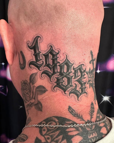
The 1983 tattoo piece she did below is an example of her work fresh and healed for her client.
1st Image: Fresh 2nd image: Healed


◼️ To learn more about HER visit her website or respective social media links on her Instagram profile: @Her.Loveletters◼️
⚜️WWW.HERLOVELETTERS.COM⚜️


◼️ To learn more about HER visit her website or respective social media links on her Instagram profile: @Her.Loveletters◼️
⚜️WWW.HERLOVELETTERS.COM⚜️


◼️ To learn more about HER visit her website or respective social media links on her Instagram profile: @Her.Loveletters◼️
⚜️WWW.HERLOVELETTERS.COM⚜️


◼️ To learn more about HER visit her website or respective social media links on her Instagram profile: @Her.Loveletters◼️
⚜️WWW.HERLOVELETTERS.COM⚜️
January 04, 2024
January 02, 2024
December 29, 2023
December 19, 2023
December 14, 2023
December 08, 2023
December 06, 2023
"At every moment I have done what I could with what I had. If you didn't have it, you looked for it or you made it up. To put it simply you adapt, this is a part of graffiti, always. Without going through a lot of grief, of course, I think it's positive to be able adapt."
-
"En cada momento he hecho lo que podía con lo que tenía. Si no lo tenías, lo buscabas o lo inventabas. En pocas palabras te adaptas, esto es parte del graffiti, siempre. Sin "Pasando por mucho dolor, por supuesto, creo que es positivo poder adaptarse".
December 02, 2023
November 22, 2023
"I like to use bright colors because in the midst of chaos, having expressive colored art draws the attention and awakens those good feelings in people. My intention is to not only influence people in graffiti but also children who are discovering new things."
⚜️
"Gosto de usar cores vivas porque, em meio ao caos, ter uma arte colorida expressiva chama a atenção e desperta esses bons sentimentos nas pessoas. Minha intenção é não só influenciar as pessoas no grafite, mas também as crianças que estão descobrindo coisas novas."
